Monday, 24 September 2012

Simon Roberts

Simon Roberts - I think the composition of this photo is effective as your eye is drawn first to the ladder in the bottom right of the picture, then is drawn to the ship in the backgreound. The effect is quite spooky when mixed with the lack of colours in the photo.

Sunday, 23 September 2012

William Eggleston

William Eggleston, Untitled (field of yellow and purple flowers), 1978
William Eggleston - I chose this photo because I think the colours are great and work really well with each other. They made the photo vivid and bright.

Friday, 21 September 2012

Robert Doiseneau

Robert Doiseneau - Great amount of humour in this picture and in many more of his pieces. Spots moments in the everyday which other's might not notice.

Martin Parr

Martin Parr Photography - Parr's photography interests me because he's not afraid to criticise or ridicule people through his photography. Some of his photos can be humorous - for example this one of hundreds of people clamoring to enjoy a fake paradise.

Gregory Crewdson

Gregory Crewdson - I find the way crewdson uses layers and backgrounds in a photograph very effective. His style is almost like that of a play or theatre, and the photograph seem very carefully composed to give depth and a story behind the photograph.

Loretta Lux

Loretta Lux - does a lot of photography with children. The most noticable thing about her work is the quirky compositions and use of toned down, pastel colours which makes her work look like something from a children's book or nursery rhyme.

Wednesday, 19 September 2012

Dorethea Lange


Can be compared to Tony Ray Jones in that she focus' on the everyday real people and their distinctive characters. I find the composition effective particularly in this photograph.

Lee Friedlander

Effective composition and use of shadow and contrast of black and white.

Tony Ray Jones


Tony Ray Jones Photography - I find his work effective and quirky. He seems to have a focus on capturing people and characters.

Sunday, 16 September 2012

Overview of Illustration week

Overall, Illustration has been an interesting topic to study. I've been most inspired by Lucinda Rogers' and Pam Smy's work. The use of pen and ink gives more freedom to their illustrations and this is a media which I would like to explore more. I find Pam Smy's work interesting as it's not always neat and tidy but it still looks effective in her sketchbook, and as a piece of work.

Thursday, 13 September 2012

Pauline Baynes


Pauline Baynes - Illustrator of The Lion, The Witch and the Wardrobe - very distinctive style and attention to detail http://briansibleysblog.blogspot.co.uk/2008/08/pauline-baynes-queen-of-narnia-middle.html

Tom Gauld


Tom Gauld - Very simple designs - comic-like and funny

Sara Fanelli


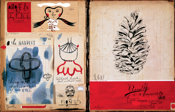
Sara Fanelli - uses pen and textured backgrounds effectively to produce varied work

Pam Smy

Pam Smy - Uses pen, quick sketches, nice style and use of colour

Tuesday, 11 September 2012

Nick White


Nick White - Illustrator
I'm interested by the mish-mash style of Nick White's drawing. He uses lots of small drawings to make a big picture.

Lucinda Rogers


Lucinder Rogers - does observational drawings similar to Ronald Searle. Vibrant use of colour and inks. Observing every day life in  the city.

Ronald Searle


Ronald Searle - Illustration artist
Uses pen and ink, acts as an observer of people - for example  in the pub he isn't noticed by the people he's drawing as their attention is on the tv